UnitedHealthCare - Level Funded A/B Test & UX Design
Designed a streamlined plan selection experience for UnitedHealthcare that clarifies pricing options and guides small businesses from entry to quote completion.
UnitedHealthCare - Level Funded A/B Test & UX Design
Designed a streamlined plan selection experience for UnitedHealthcare that clarifies pricing options and guides small businesses from entry to quote completion.
UnitedHealthCare - Level Funded A/B Test & UX Design
Designed a streamlined plan selection experience for UnitedHealthcare that clarifies pricing options and guides small businesses from entry to quote completion.
Problem
Users struggled to understand differences between custom and traditional pricing plans
Lack of clear entry point created friction early in the funnel
Weak comparison experience made plan selection and decision-making difficult
Action
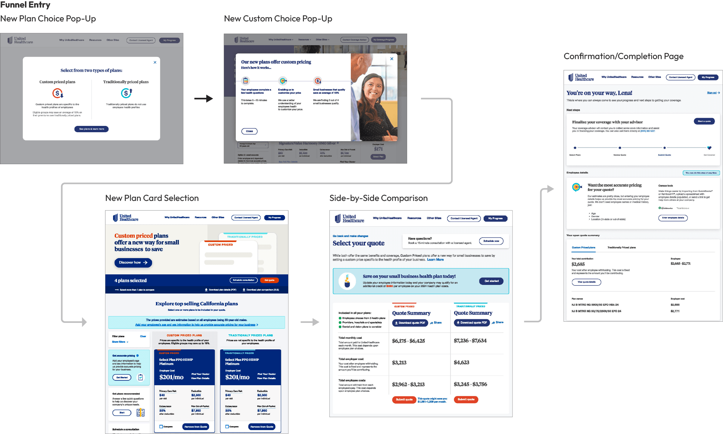
Introduced guided entry pop-ups to segment users by plan type from the start
Designed structured plan cards and side-by-side comparison to clarify options
Built a streamlined funnel flow from selection through confirmation with clear hierarchy and CTAs
Result
Increased clarity around plan options, reducing confusion at key decision points
Improved engagement with plan selection and comparison tools
Strengthened progression through the funnel, leading to higher quote completion rates
Problem
Users struggled to understand differences between custom and traditional pricing plans
Lack of clear entry point created friction early in the funnel
Weak comparison experience made plan selection and decision-making difficult
Action
Introduced guided entry pop-ups to segment users by plan type from the start
Designed structured plan cards and side-by-side comparison to clarify options
Built a streamlined funnel flow from selection through confirmation with clear hierarchy and CTAs
Result
Increased clarity around plan options, reducing confusion at key decision points
Improved engagement with plan selection and comparison tools
Strengthened progression through the funnel, leading to higher quote completion rates
Problem
Users struggled to understand differences between custom and traditional pricing plans
Lack of clear entry point created friction early in the funnel
Weak comparison experience made plan selection and decision-making difficult
Action
Introduced guided entry pop-ups to segment users by plan type from the start
Designed structured plan cards and side-by-side comparison to clarify options
Built a streamlined funnel flow from selection through confirmation with clear hierarchy and CTAs
Result
Increased clarity around plan options, reducing confusion at key decision points
Improved engagement with plan selection and comparison tools
Strengthened progression through the funnel, leading to higher quote completion rates